Designing the UX of Wozdle (Wozdle 2/3)
A big part of the fun of developping for vintage computers is that we operate within a set of hard constraints. The graphical rendering is often one of the most stringent one. In the case of the Apple 1, here are the list of constraints that impacts the Wozdle design. Most are not apparent when looking at a screenshot.
XXX insert an hex dump of an apple 1 and one of an apple 2.
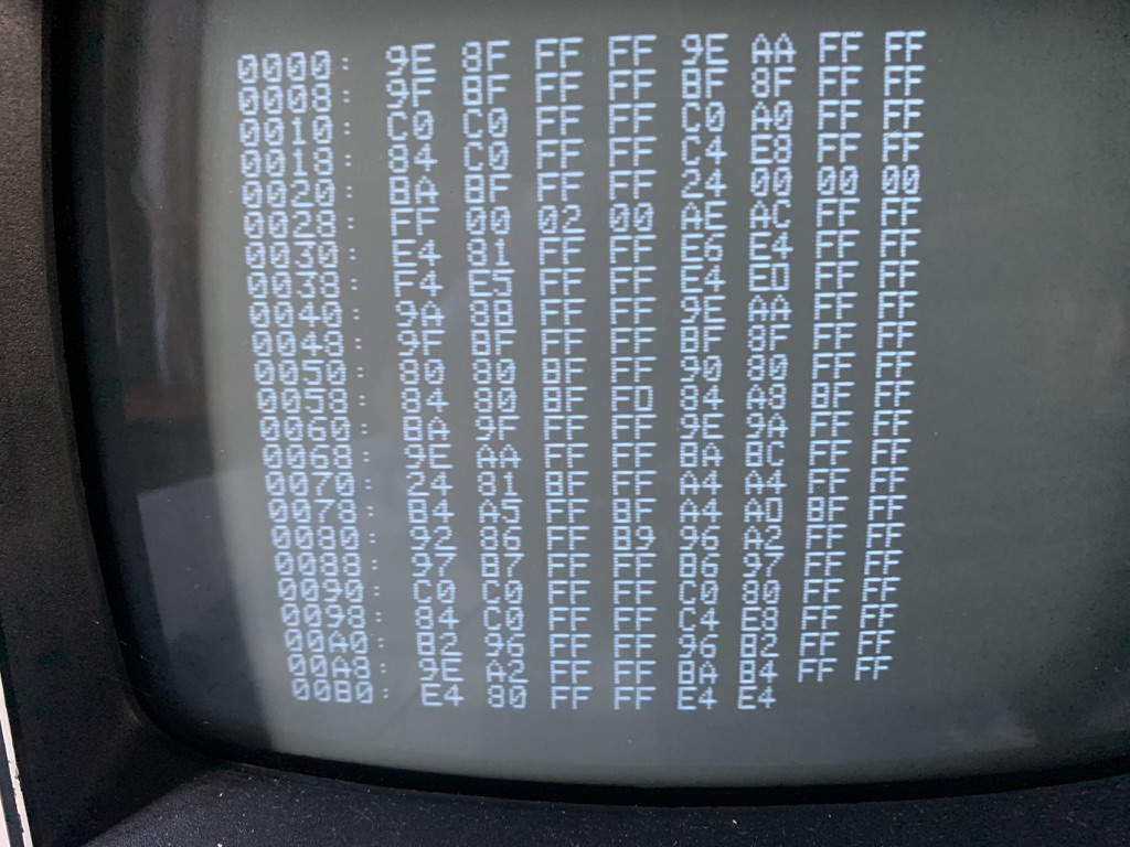
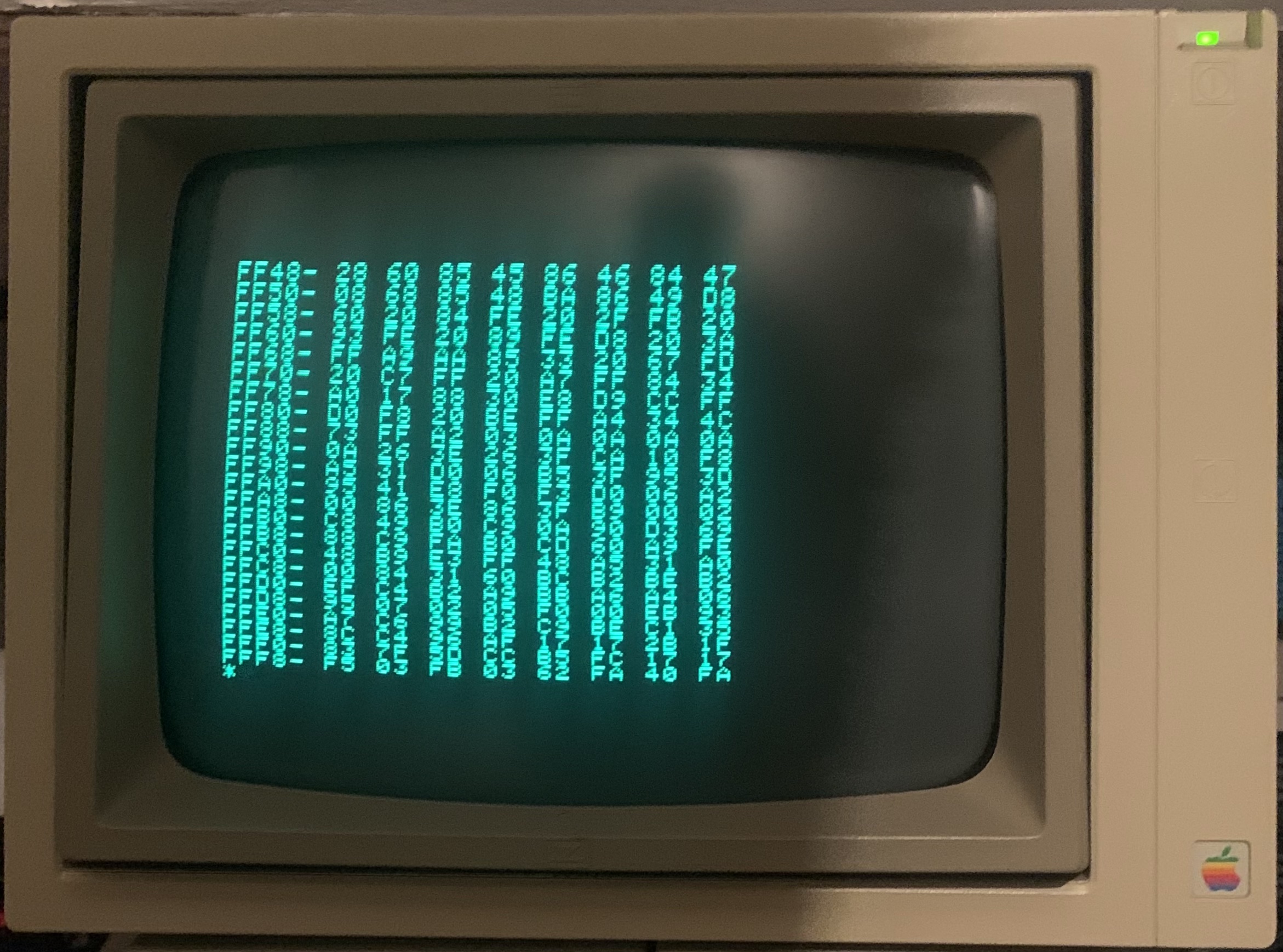
Note: the legend of those images may have been swapped.
The constraints #
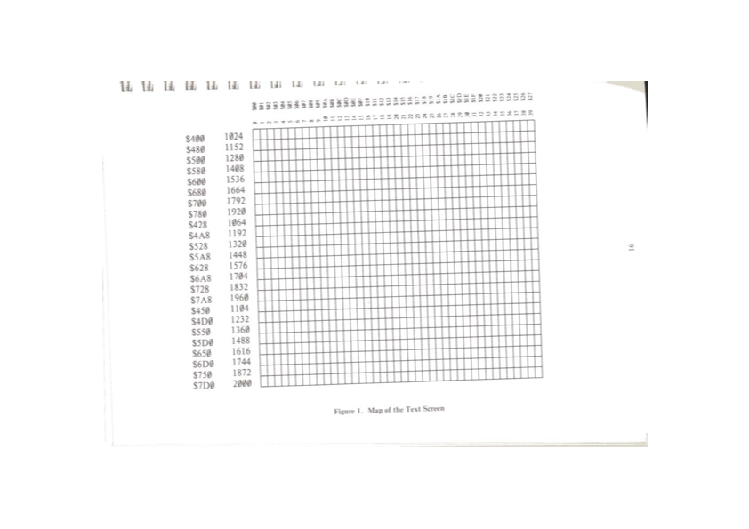
- Screen is 40x25 characters
Ok, this is not different from the Apple ][. There is no graphic mode, thought, but this is not a surprise.
- There is no color
Again, no a problem. And the Apple ][ didn't have color text mode either.
- There are 64 characters:
@ABCDEFGHIJKLMNO
PQRSTUVWXYZ[\]^_
 !"#$%&'()*+,-./
0123456789:;<=>?
This is very similar to the Apple ][, again. We only miss the inverse chars and the blinking ones. Not really a problem.
All in all, those are quite "normal" constraints, for vintage computers.
However, there are harsher ones:
- You can only write one character per screen-refresh (16ms)
Yes. Everytime you want to output a character, you have to wait for the screen to "pick it up", and this happens only once per frame. This is a hardware feature, there is no way around it. It takes 16 seconds to fill the screen with information...
- This character is always at the cursor position
The character you want to ouptut will be placed at the "cursor" position. The hardware maintain the cursor position for you (in fact the screen subsystem grabs a character only when displaying the top line of the current cursor, and this operation advances the cursor)
- You cannot move the cursor on screen
Oh, you want to update any part of what is already displayed? Forget about it. The cursor only advances left, or down, if you output a carriage return.
- You cannot clear the screen
Already told you. The only thing you can do is output a character at the current cursor position.
There is one fortunate positive:
- Carriage return and associated scrolling is as fast as writing a character
So you can actually clear the screen in 0.64 seconds! (but your cursor will be located at the bottom of the screen)
Looking at those constraints, it is clear that the Apple1 screen really is a Teletype, with only 24 lines of history. What we are really doing is design Wordle for a teleptype. Maybe I can reuse the code for an ASR-33 Wordle one day?
So, from a UX standpoint, this is pretty tough. What you see as a monitor, but is closer to a teletype.
The UX design #
We want, at any point in time, the display to contain at least:
-
An indication of the game progress (how many guesses did you made)
-
The history of the previous guesses (total number of allowed guesses is 6)
-
The responses for each of those guesses (which characters were properly placed, which we not properly placed, which are not in the target word)
-
The list of characters you have not tried yet.
-
Nice to have: the list of character you already found
In the web based version of Wordle, the last two are displayed as a keyboard. This would be a nice touch to keep.
However, the core problem is that we cannot update what is already displayed and filling a single screen with information takes 16 seconds. It is obvious that we need to have some sort of line-oriented approach. I told you it was an ASR33...
The design is that the game will play on a single 40x25 screen that will fill during gameplay. Redrawing the whole screen must be exceptional.
The game is played in 6 rounds, where the player enters a word, and see how it did.
Based on the above constraints I derived the following design principles:
-
All guesses must be visible on screen
-
As there are 24 lines, each guess will take 4 line
-
If there is any mistake made in entering, we will scroll out and redraw the whole screen, as there is no way to "undo" what we displayed. We will only redraw what is important for the gameplay, so:
-
The guesses will be placed on the left of the screen, so they can be displayed quickly when we need to redraw the full screen.
-
The right side will contain the "keyboard", with the status of each letter.
-
This keyboard is only useful for the current solution. If we need to refresh the screen, we will not draw the keyboard for any guesses but the last.
Now, the "graphical" design
The user will directly type his guess.
In order to have some "breathing room", we will add a space between each word letter.
This means that the left side of the screen is going to use 9 characters for the guess.
On the line under the guess, we will put the result ('?' and '!' to indicate which characters were correct)
We will need some sort of separator and have 30 characters left to draw the "keyboard".
Each "key" of the keyboard needs a "keycap", some sort of status, and there is a need for a separator, so we need 3 characters per key. The longest keyboard row, the top one, is "QWERTYUIOP", and exaclty 10 character wide, which is a sign of the gods, 9+1+30=40.
Displaying a "full" 4 lines guess takes 16ms*40*4 to display, which is 2.5 seconds.
However, displaying only what the user entered followed by the feedback and two empty lines costs 16ms * 22, which is .3 seconds, almost 10 times faster, so we can quickly redraw the screen in case of failure.
The rest of the UX is pretty simple, an intro screen (with a "press space to start" message, really used to seed the random number, and a win and loose screen, with a recap of the game)
All in all, I am extremly happy at the resulting UX. I find the game as enjoyable as the web version, maybe even more focused. In my opinion, there is nothing to add and nothing to remove. Antoine de Saint Exupery would be happy.
This UX would also work pretty well on a teletype, the only change would be that there is no need to redraw the whole thing when the user makes a mistake, as the paper trail is still here (we are not limited to 24 lines)
...to be continued...